Redesigning my Little Corner of the Web
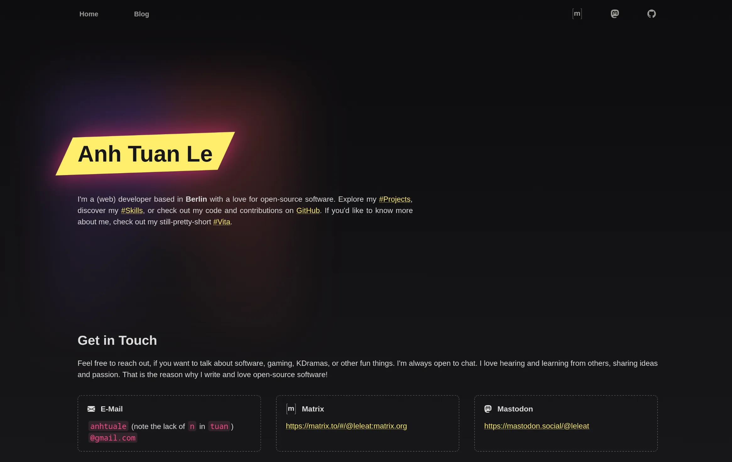
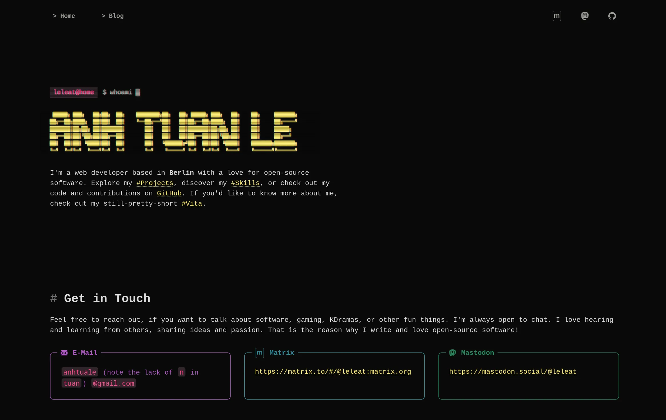
I've recently redesigned my website. I went for a more terminal-y look. Here are some screenshots showing the old and new look.
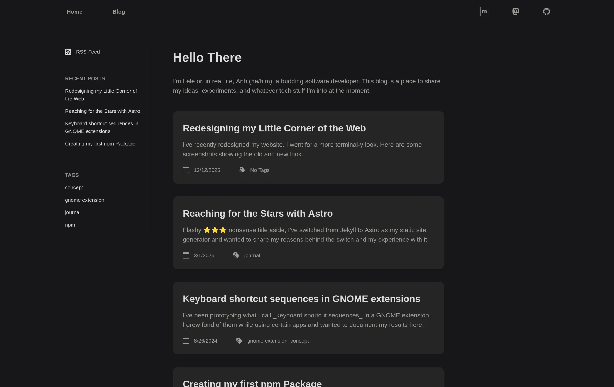
Layout-wise, my blog used to be very simple: just a list of all my posts in reverse chronological order. Yesterday, I read a blog post by Lalit Maganti about his own redesign, where he links to a post by Evan Martin. In that post, Martin argues that having a reverse-chronological homepage doesn't really make sense when your writing covers unrelated topics. And I do see his point, which is why I decided to rethink the layout of my blog as well.
Earlier this week, I had already added categories after reading Simon Willison's What to blog about. My categories are few and fixed in number. So they are a natural way to structure the landing page.
So now, the page shows the three most recent posts in each category.
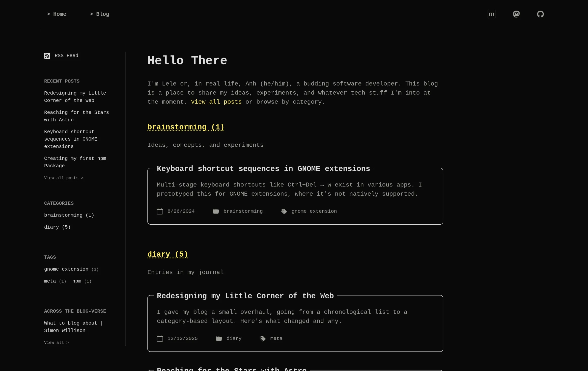
I tried a multi-column layout, but because the category descriptions and post cards vary in length, posts and text were misaligned. I didn't like that, so I went with a single-column design instead. Since the landing page no longer lists all posts, I also added an archive, which is basically the old view: a full reverse-chronological list.
And lastly, loosly inspired by Simon Willison's Link Blog and Blogrolls, I added a section in the sidebar with links to posts I've enjoyed reading. I'm calling it "Across the Blog-verse" (a reference to Across the Spider-Verse). It's a manually curated list, and I'll update it whenever I come across something great. Check it out here.